
Project Goals
CircleCI’s developer hub and documentation site were isolated on separate platforms, making it difficult for users to navigate and find relevant information. To create a more seamless and effective experience, the project aimed to unify these resources into a single, structured site that aligned with user needs, improved accessibility, and provided a consistent, modern interface using the design system.
Problem
Solution

My Process
- Site audit: Screen capture and inspect both sites to compare and identify inconsistencies, patterns, and structures.
- Accessibility audit: Use plugins to assess accessibility against WCAG standards.
- Research: Gather research and analyze findings to identify user needs and requirements.
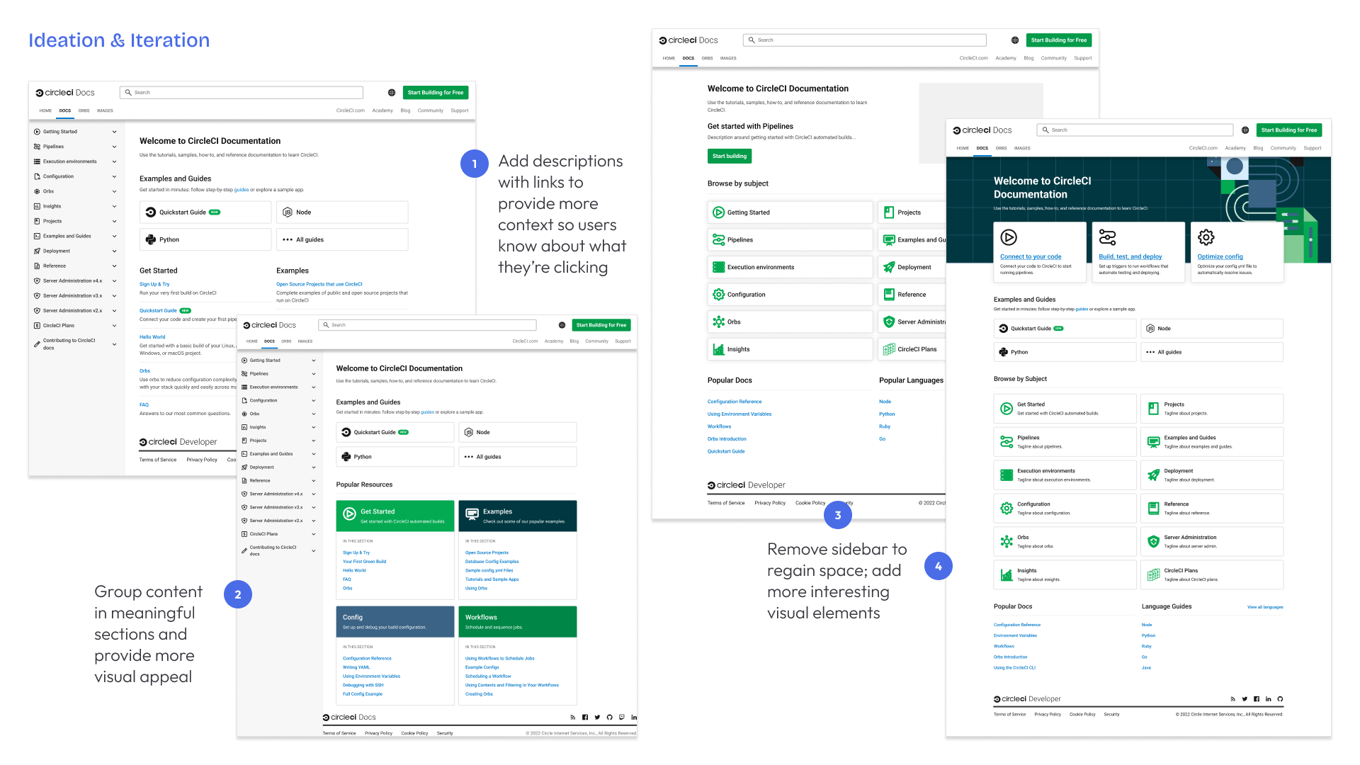
- Ideate: Wireframe and mock up dozens of iterations and possible solutions.
- Feedback: Solicit feedback from a wide variety of stakeholders to meet all business requirements.
- Refine: Use feedback to improve the iterations until we had the desired solution.
- Ship: Work closely with engineers to build and ship the final designs.
- Monitor: Collaborate with product to monitor built-in analytics and track performance.


Research & Analytics
I was able to use a mixture of resources and prior research to validate the principles and approach to this design.
- Internal interviews: I conducted informal interviews with internal stakeholders, including the team that manages user requests regarding the site.
- Marketing review: I analyzed the existing marketing website and underlying research to understand what educational content the company prioritizes.
- Top Tasks analysis: I reviewed prior research assessing what information prospective and existing customers want to know.
- Experiment results: A prior experiment for new users provided valuable insight into some items that were not as useful as we hypothesized.
- Competitor analysis: I reviewed competitor dev hubs, docs sites, and papers regarding what users want in a CI tool.
Core Principles
Clear navigation
- There are a variety of user types for this site, so navigation must be as clear as possible to provide the fastest possible path to what different users want to find.
Hierarchy and visual appeal
- A primary complaint about the site was that it was a "wall of text" - which was both uninteresting and provided no clear calls to action.
Exploration funnel
- We also wanted to add more ways for users to sign up and try CircleCI from the developer hub. We wanted to lower the barrier between information gathering and taking action.
Project Execution
We split this project into multiple stages to accomplish several goals. First, we prioritized back-end work to replatform both the developer hub and the documentation website, in order to be able to combine them into a single site. During this phase I worked with the developers to consider major architectural changes. Then, we used my site audit to apply the CircleCI design system to both sites in order to create cohesion, apply proper branding, and address accessibility concerns. We moved to front end updates, starting with the developer hub site which would become the new landing page for the combined site. Finally, we updated the docs landing page to complete the project.


Result
We released the new combined site on schedule and implemented analytics tracking to assess our assumptions and prepare for future iterations. At the time of release the redesign improved our accessibility compliance by 20% (as measured via Lighthouse and WCAG audits), and shortly afterward we saw a 30% increase in engagement with the key documentation pages targeted for the intended audience.